
Stoke
Branding
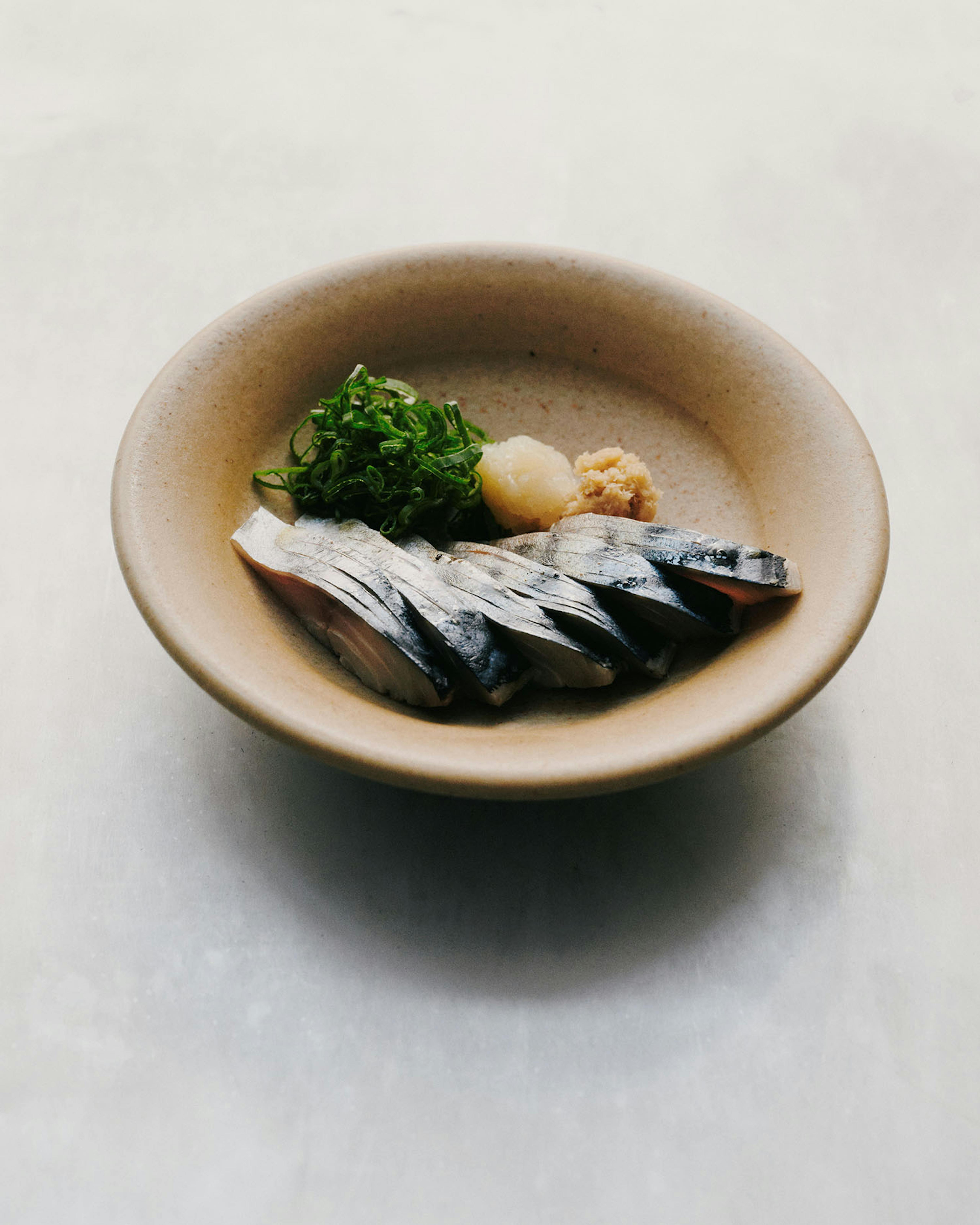
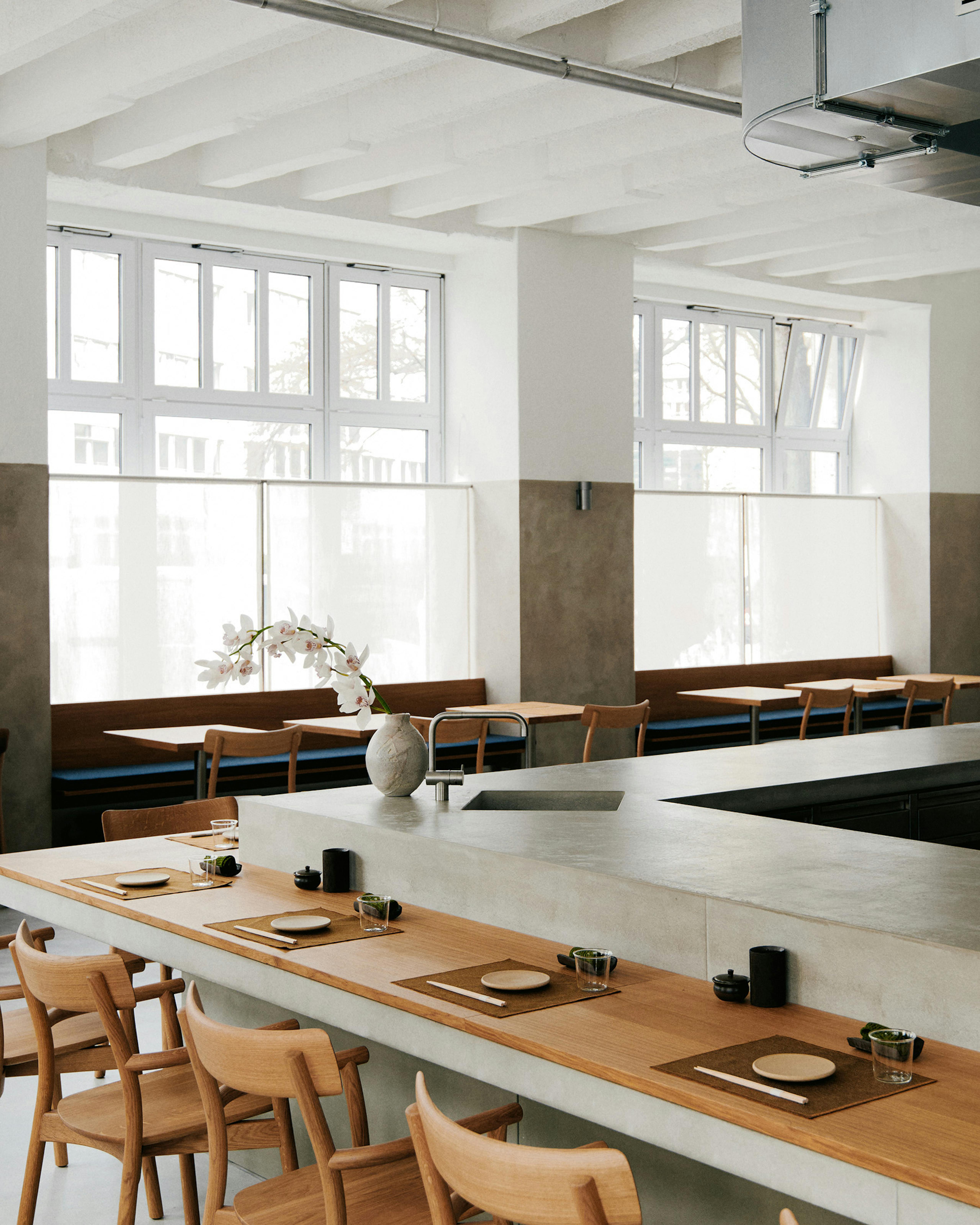
Visual identity for STOKE, a Berlin-based yakitori and wood fire restaurant, along with its pop-up ToriKabin, in collaboration with Phamily First.
2023
Credits
- Project Manager Julien Pham (Phamily First)
- Commissioned by Jessica Tan, Jeffrey Claudio & Niklas Harmsen
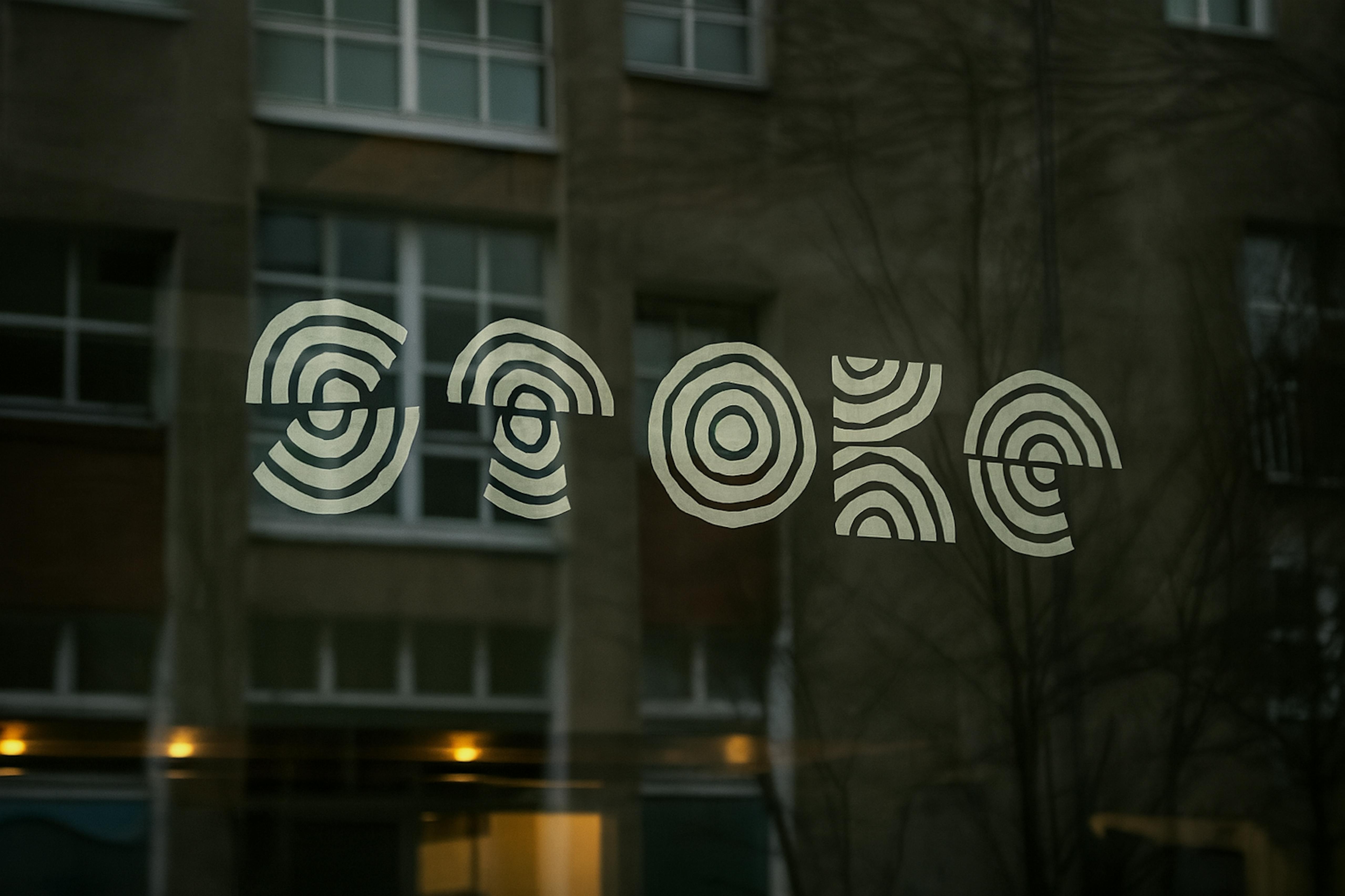
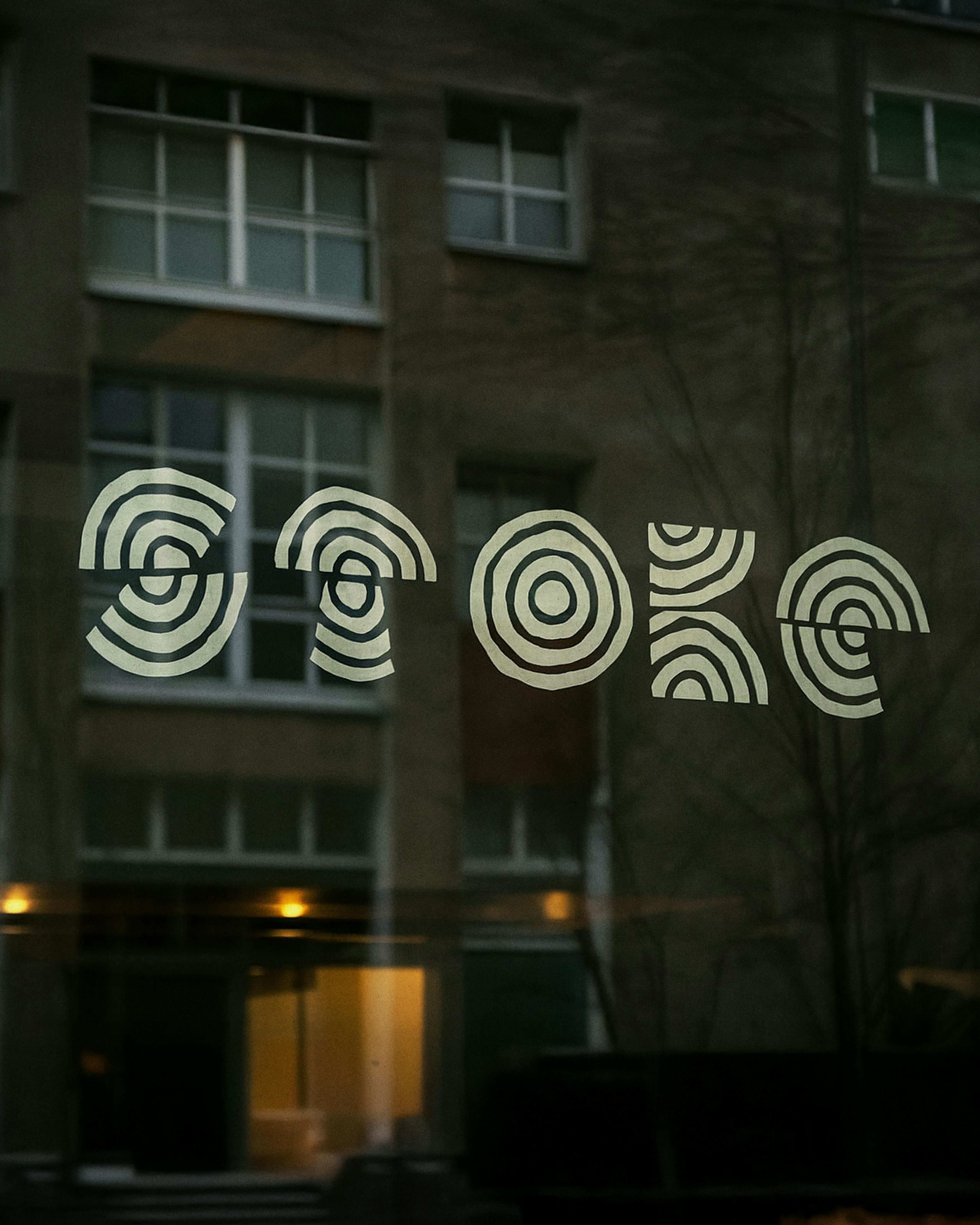
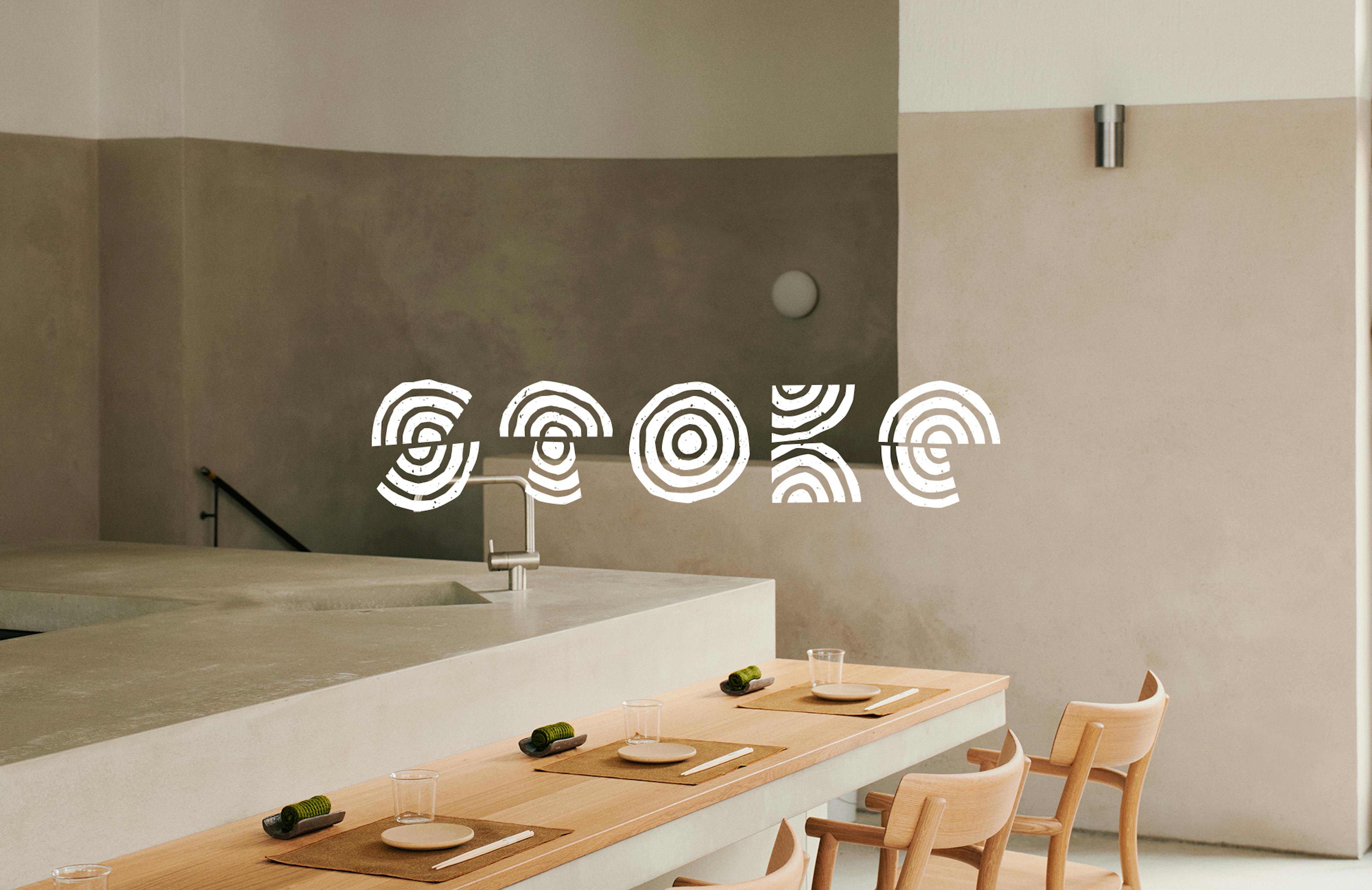
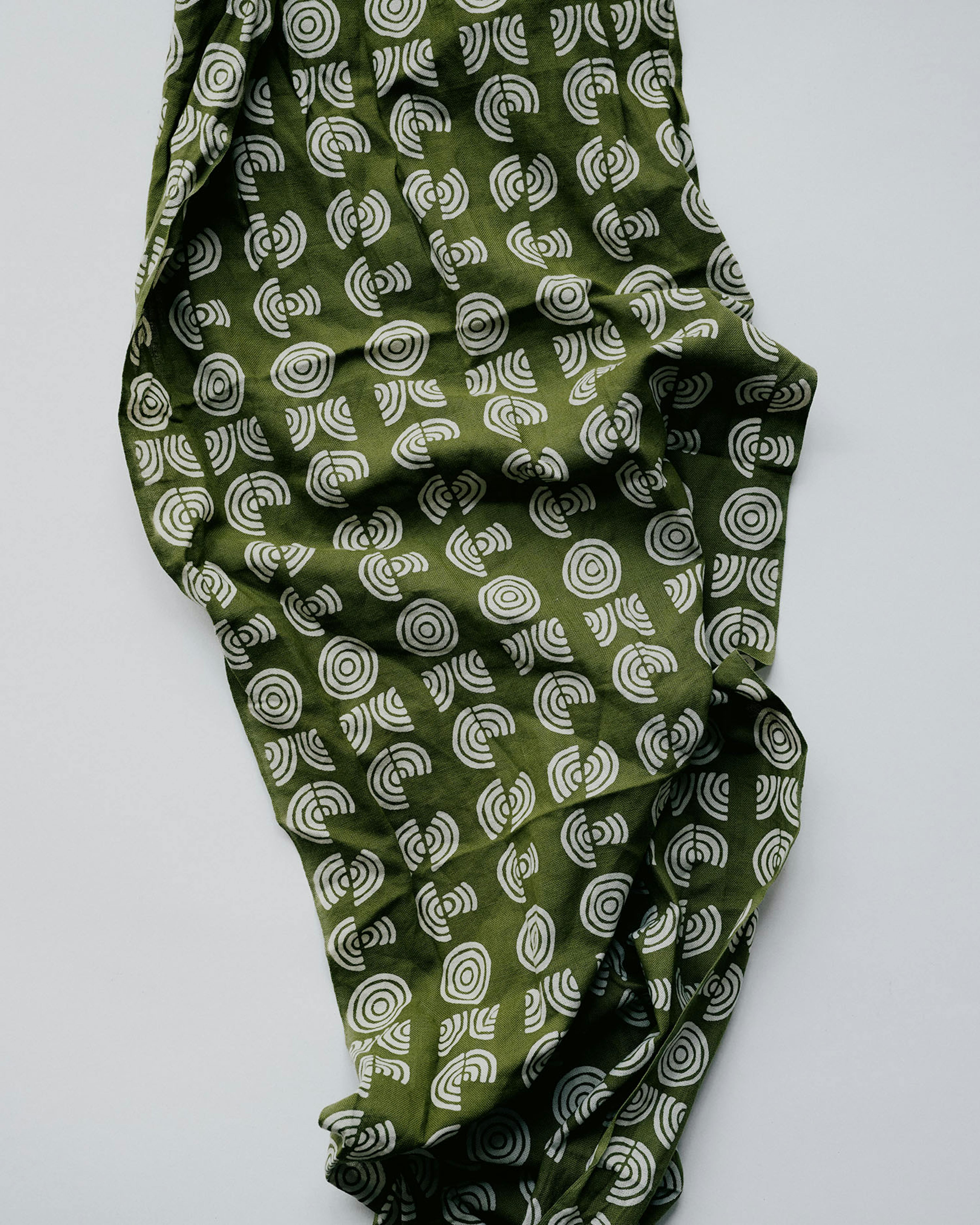


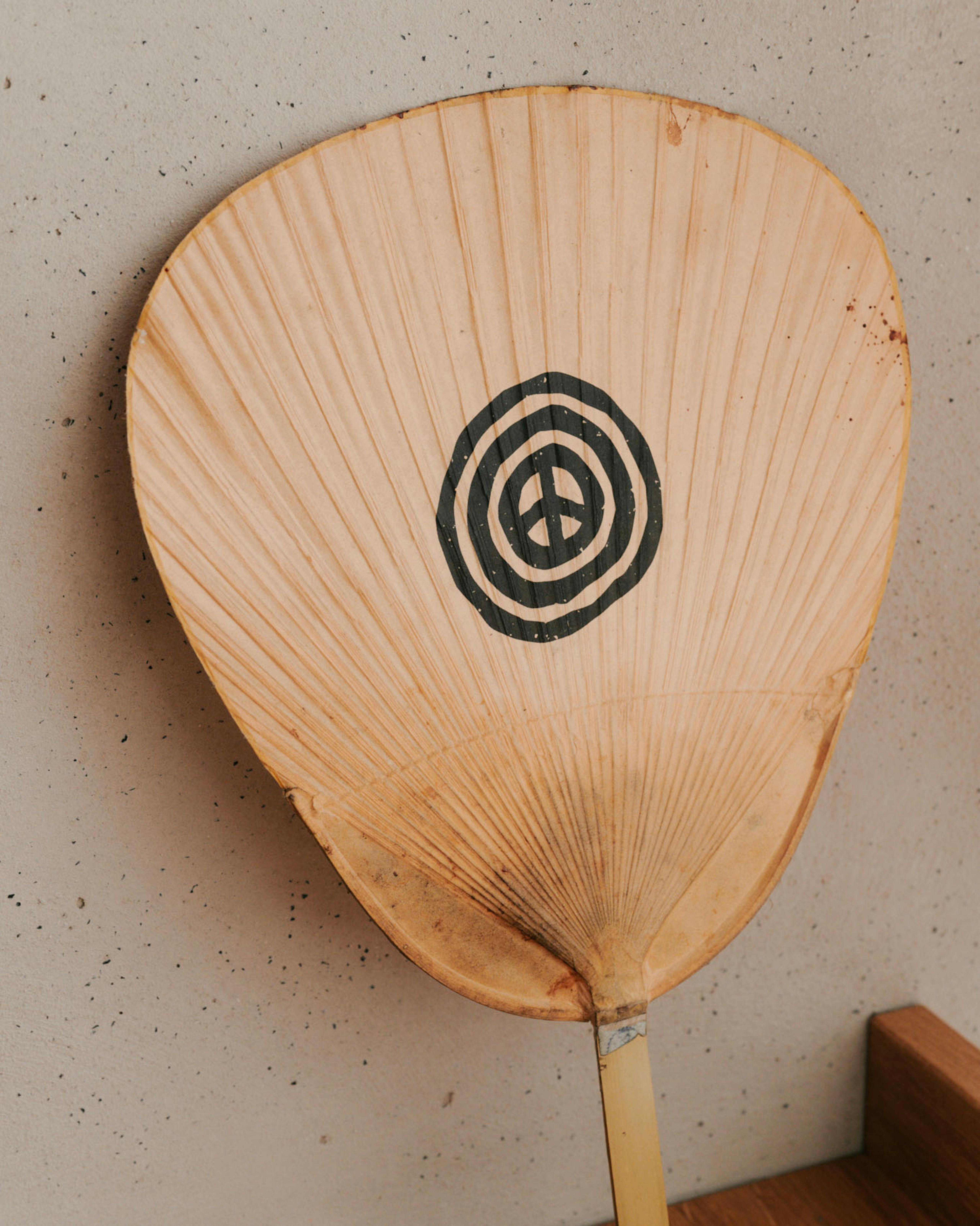
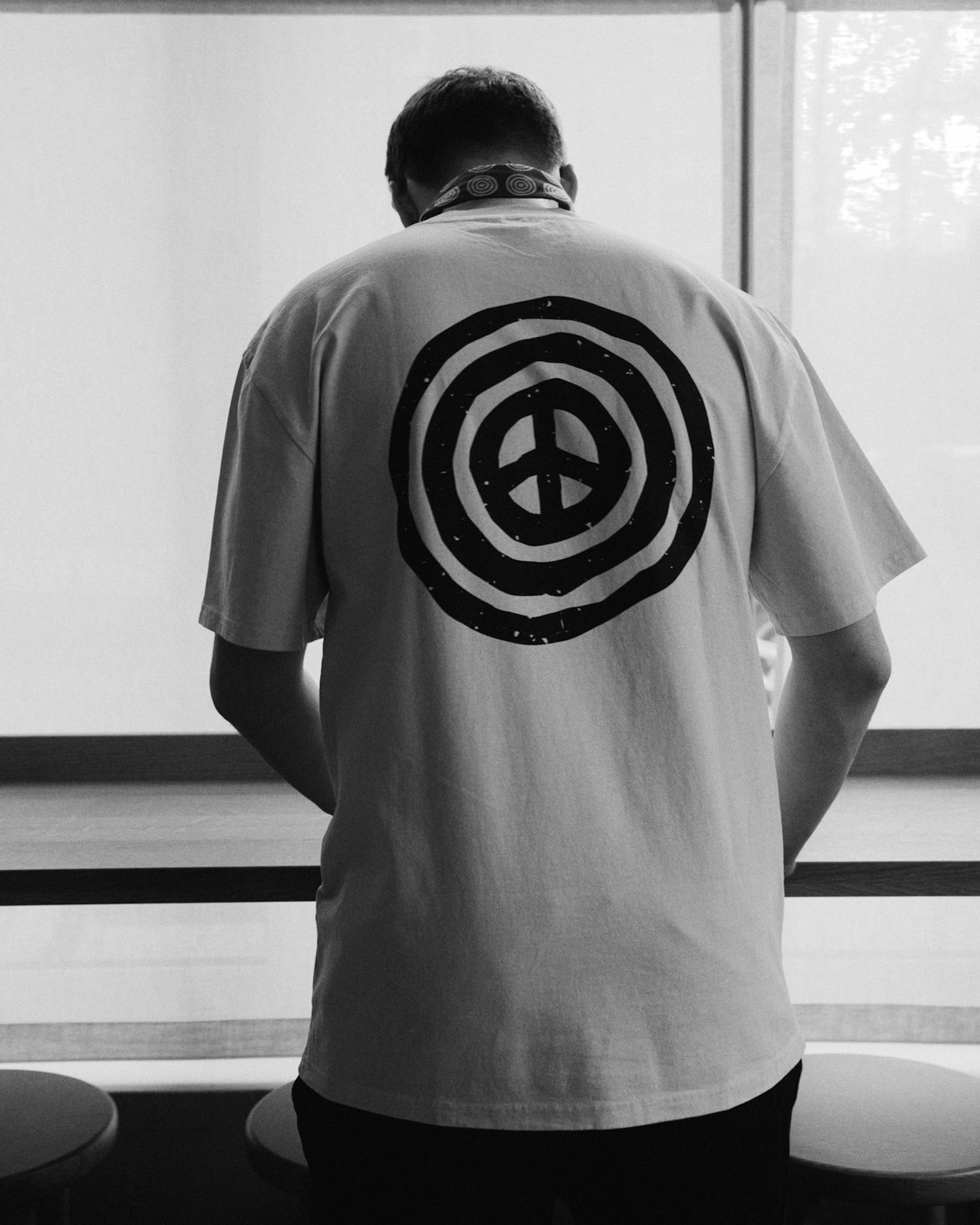
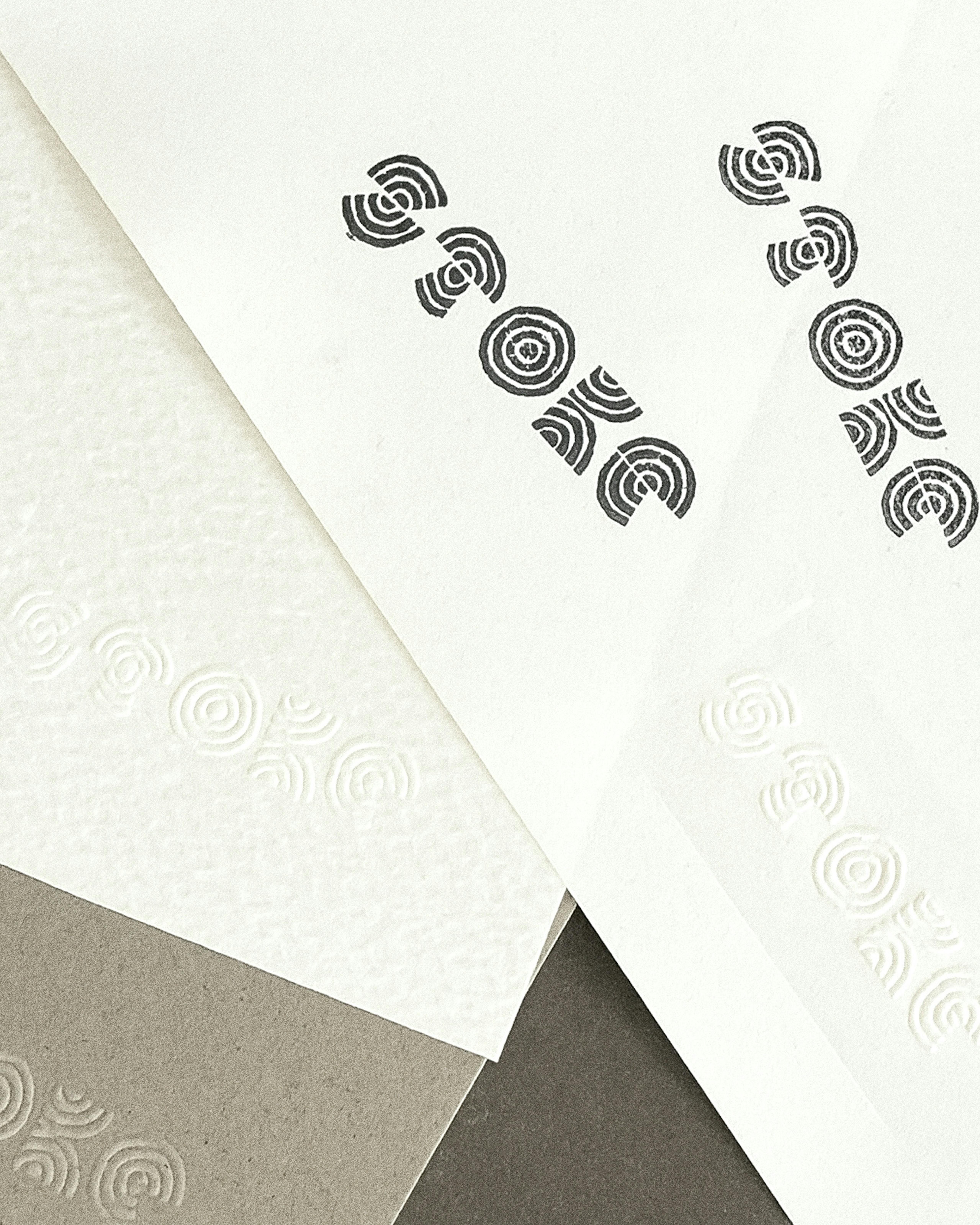
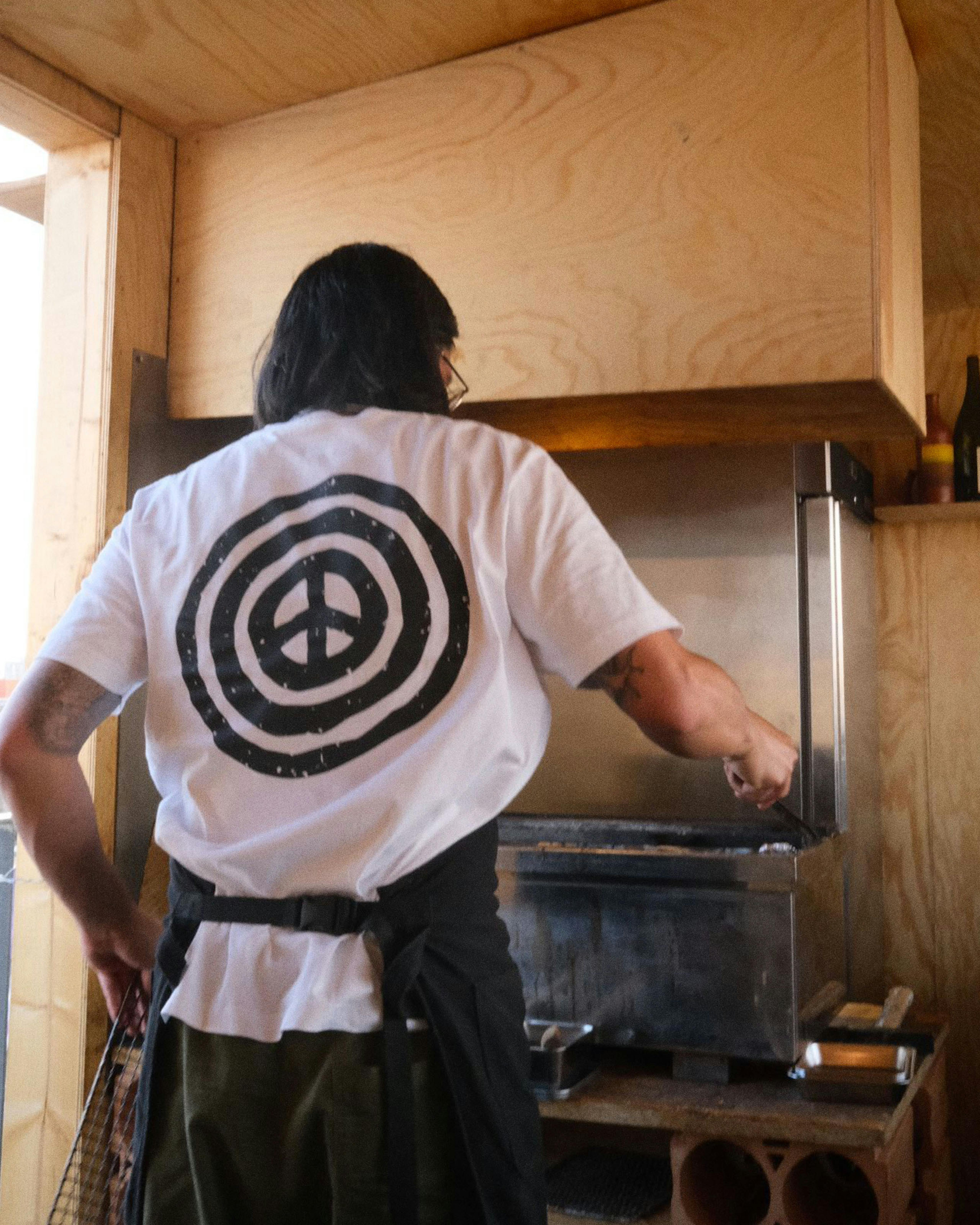
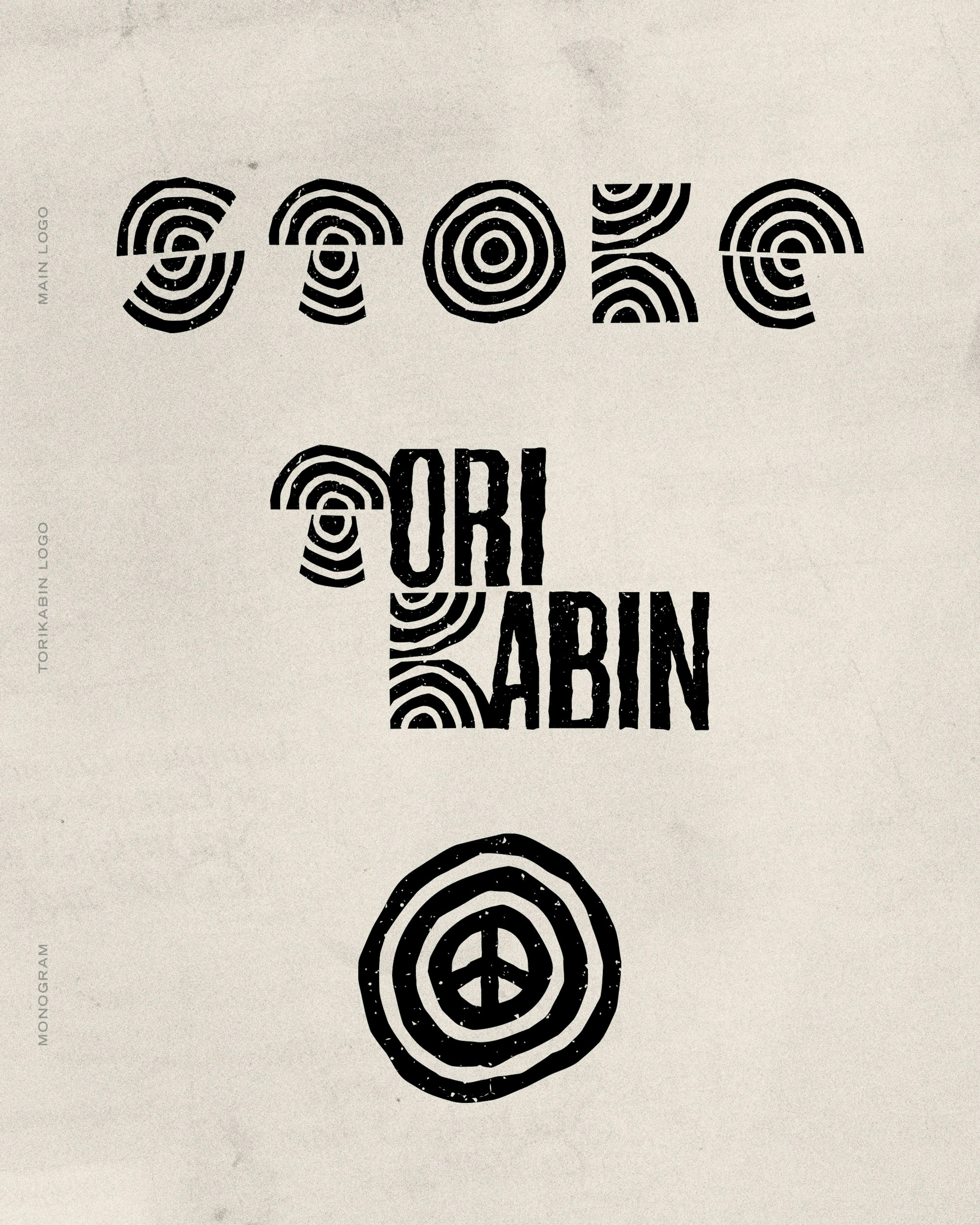
The peace sign surrounded by three circles is a key element of the identity, symbolizing the three founders and their shared values of community, creativity, and collaboration.
Credits
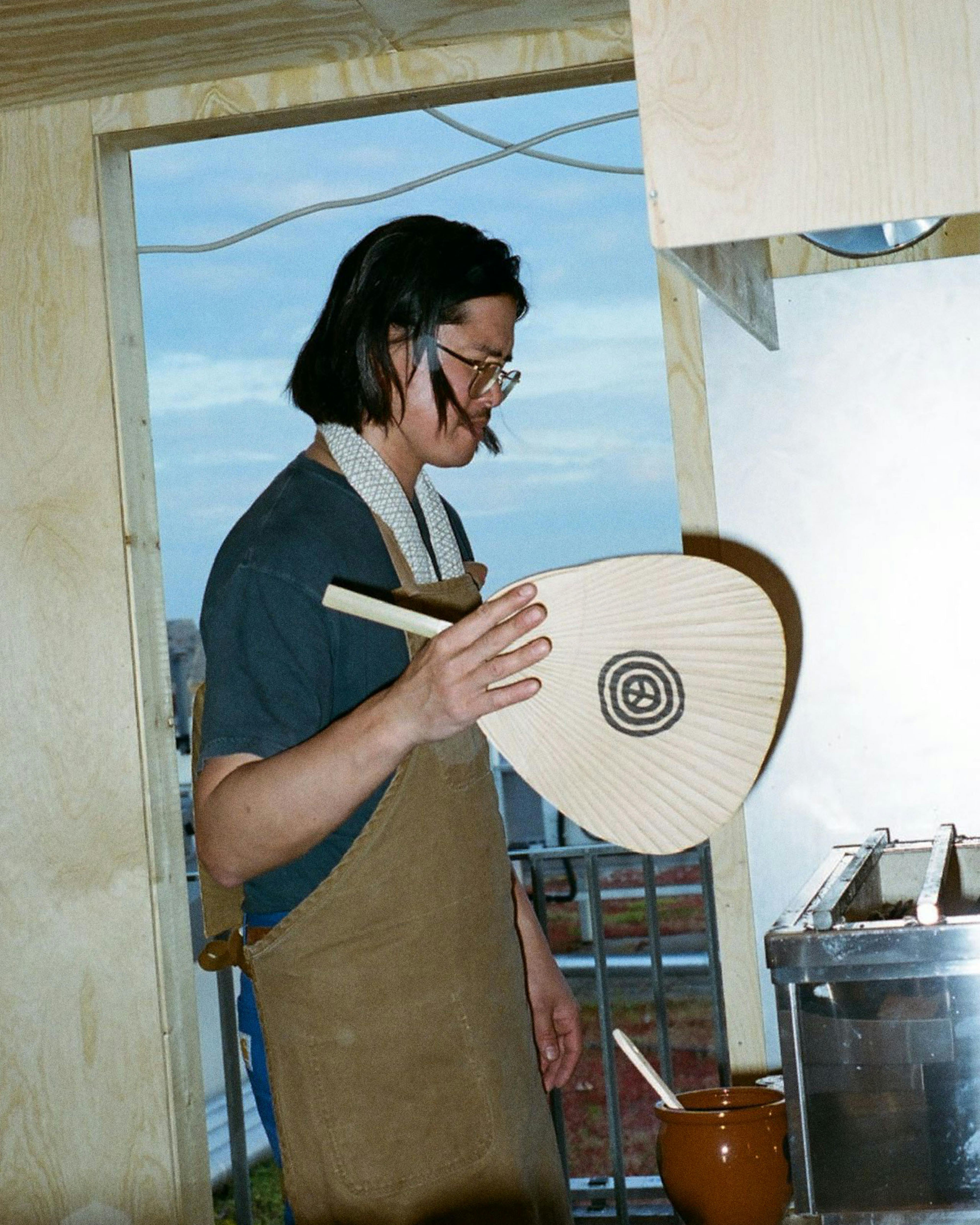
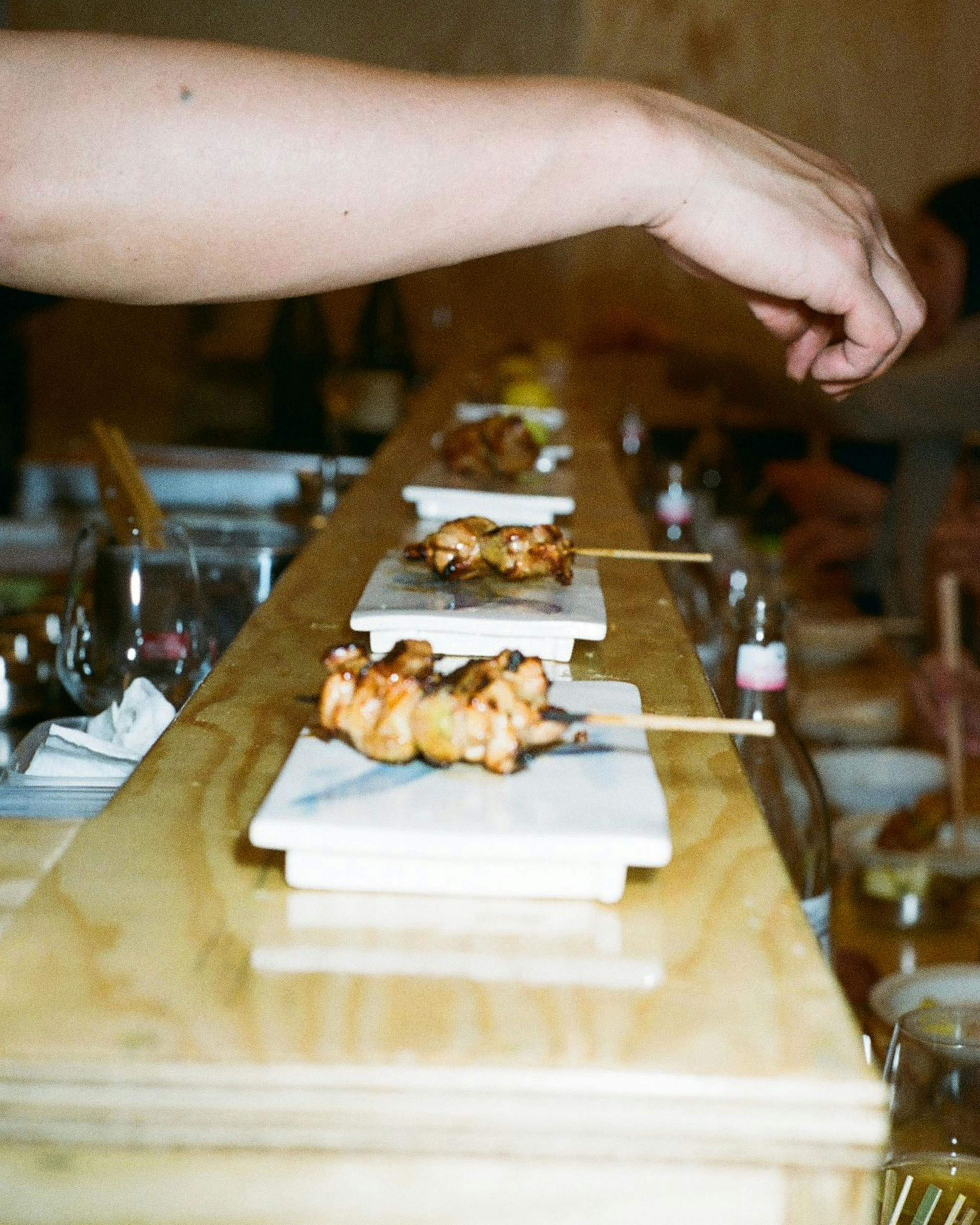
- Photographer James Nelson & Chaemus Macmillan
- Art Direction Jessica McGowan
- SignPainting Studio ELM


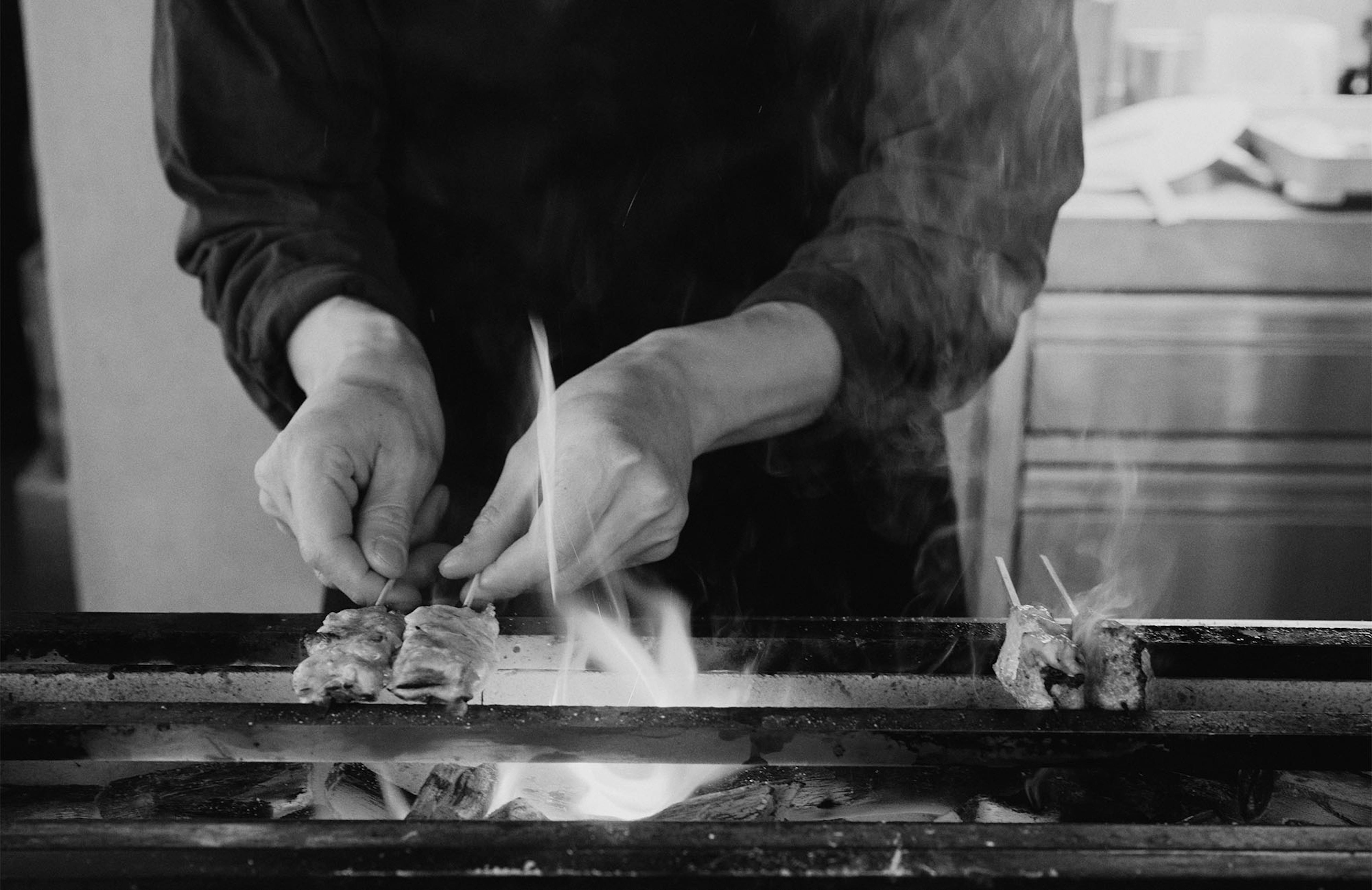
The original inspiration for Stoke came from the work of Brian Nash Gill and George Nakashima, and their deep, respectful relationship with wood. Stoke carries that spirit forward by transforming wood’s energy into beautifully crafted food and meaningful experiences.
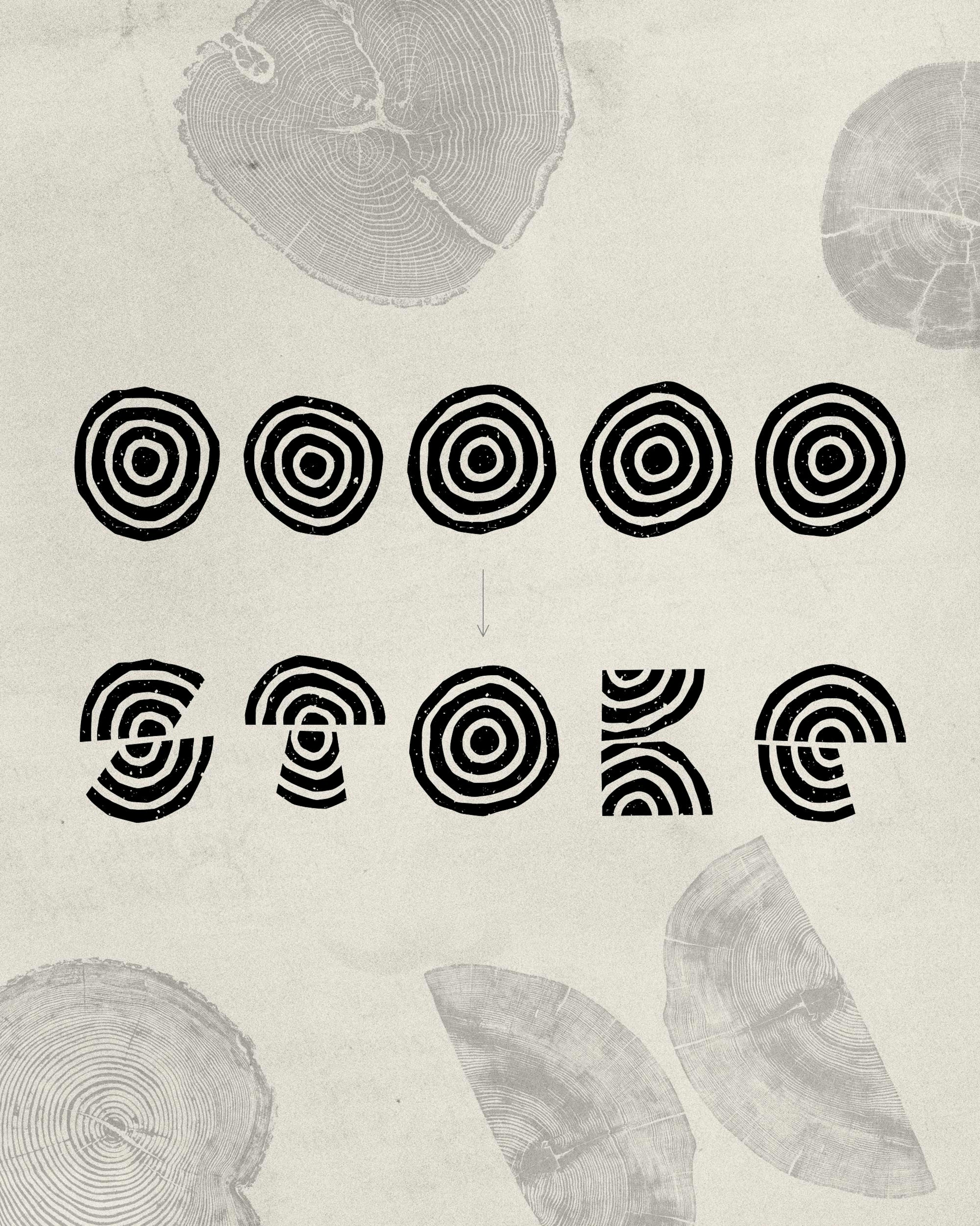
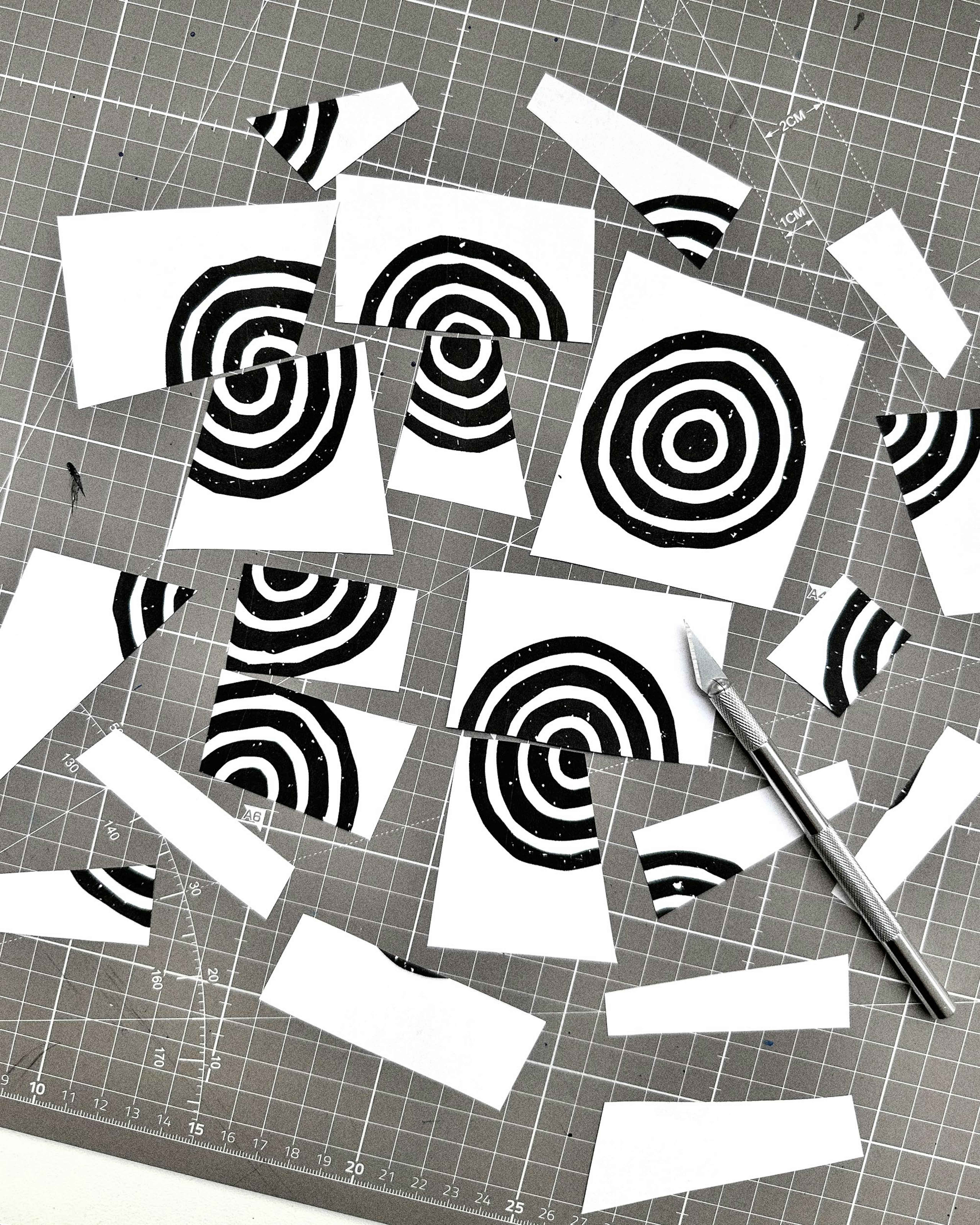
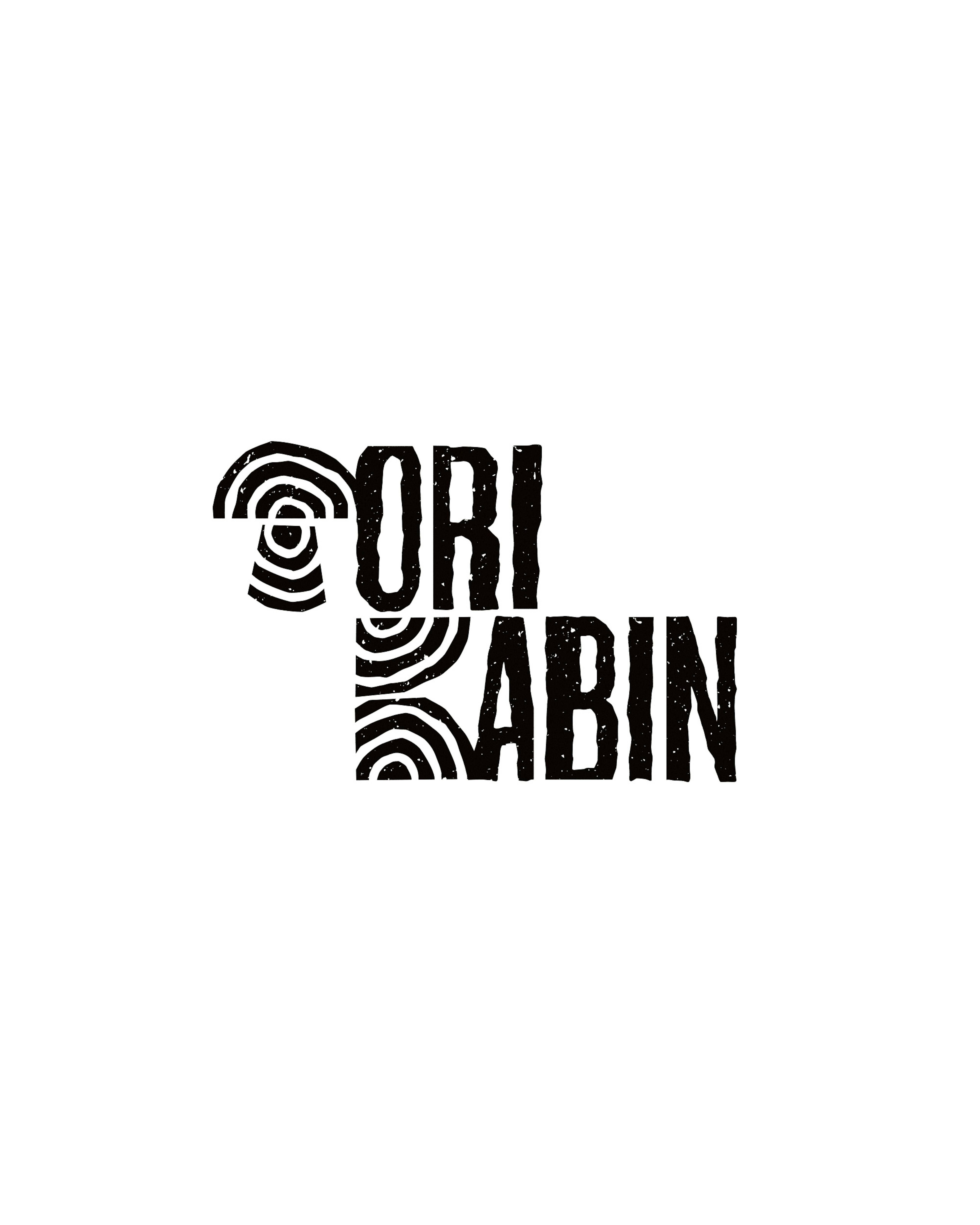
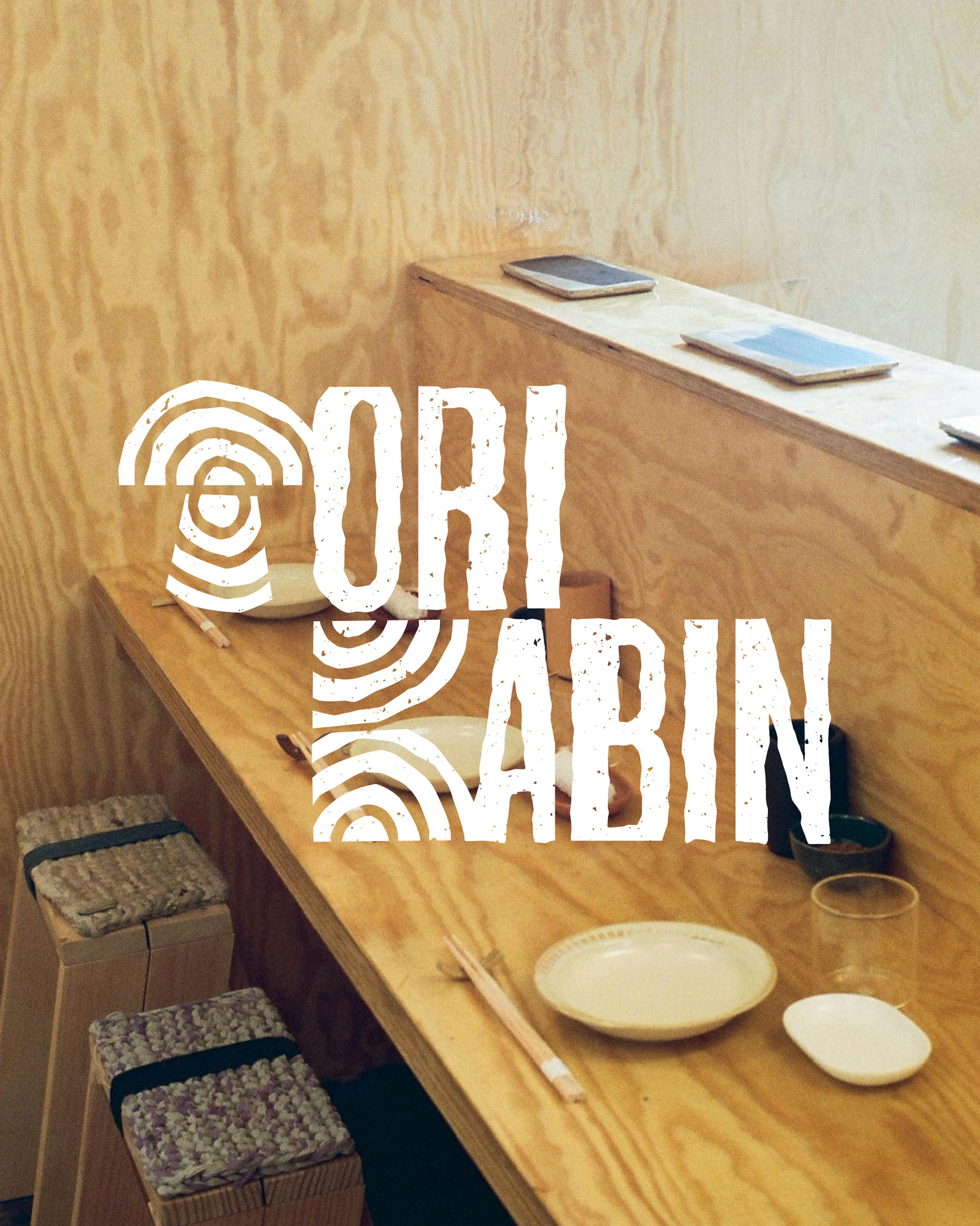
While waiting for the restaurant to open, the Stoke team set up a temporary pop-up inside a small cabin perched on a Berlin rooftop. Called Torikabin, we created a short-lived visual identity inspired by Stoke’s own. We borrowed two letters from the original name and reinvented the rest by slicing and reshaping letterforms to reflect the narrowness of the space.

Studio Tyrsa
Copyright 2025